Relief RS-16
Play with it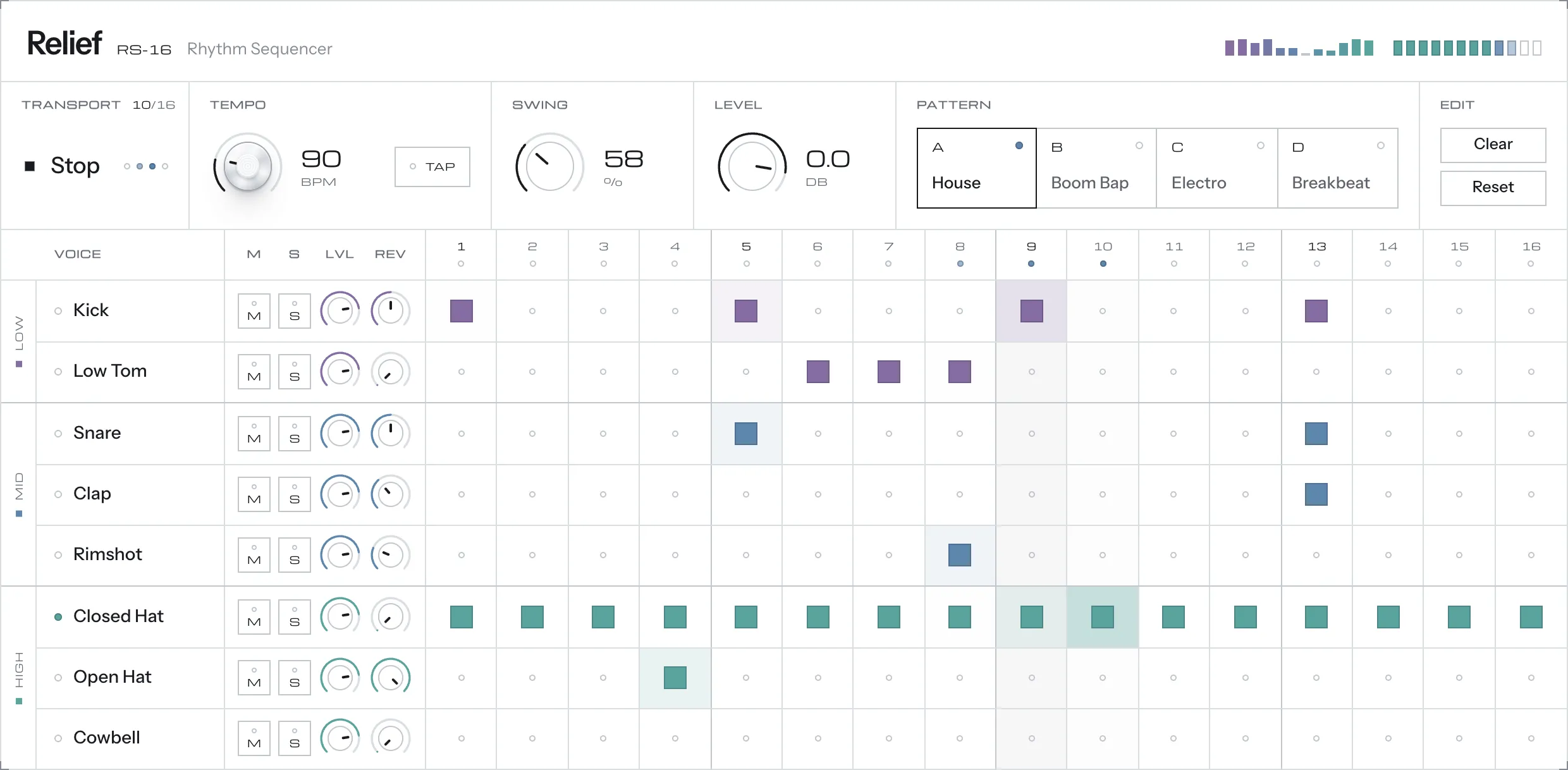
Relief is an interface experiment. How flat can a control surface be and still give enough affordance? The test bed is a 16-step drum machine in the browser, drawn flat like a spec sheet, where every control rises into a physical key, plate or knob at the moment of interaction.
- Focus: interaction and visual design; the drum machine is the test bed
- Built with: HTML, CSS, SVG and JavaScript in one file, no frameworks
Why I made it
I’ve made music as a hobby for years, much of it with synthesizers and VST instruments. What always drew me in was the interface, at a time when having the coolest looking instrument was a selling point. These were dense little machines, with buttons and knobs all over, and that density makes an interesting design challenge.
I’ve always been a fan of the works by Dieter Rams and his Braun product designs. Less, but better, and a product that explains itself. Software interfaces tend to go one of two ways. Flat ones look calm but lack affordance. Skeuomorphic ones show every screw and get noisy fast.
Relief asks whether you can have both. The calm of flat design at rest, and the obviousness of a physical object when you reach for it. A drum machine made a good test bed, because it packs dozens of knobs, keys and toggles into one dense panel and I’ve always wanted to design one.
Design principles
Flat at rest, physical on touch
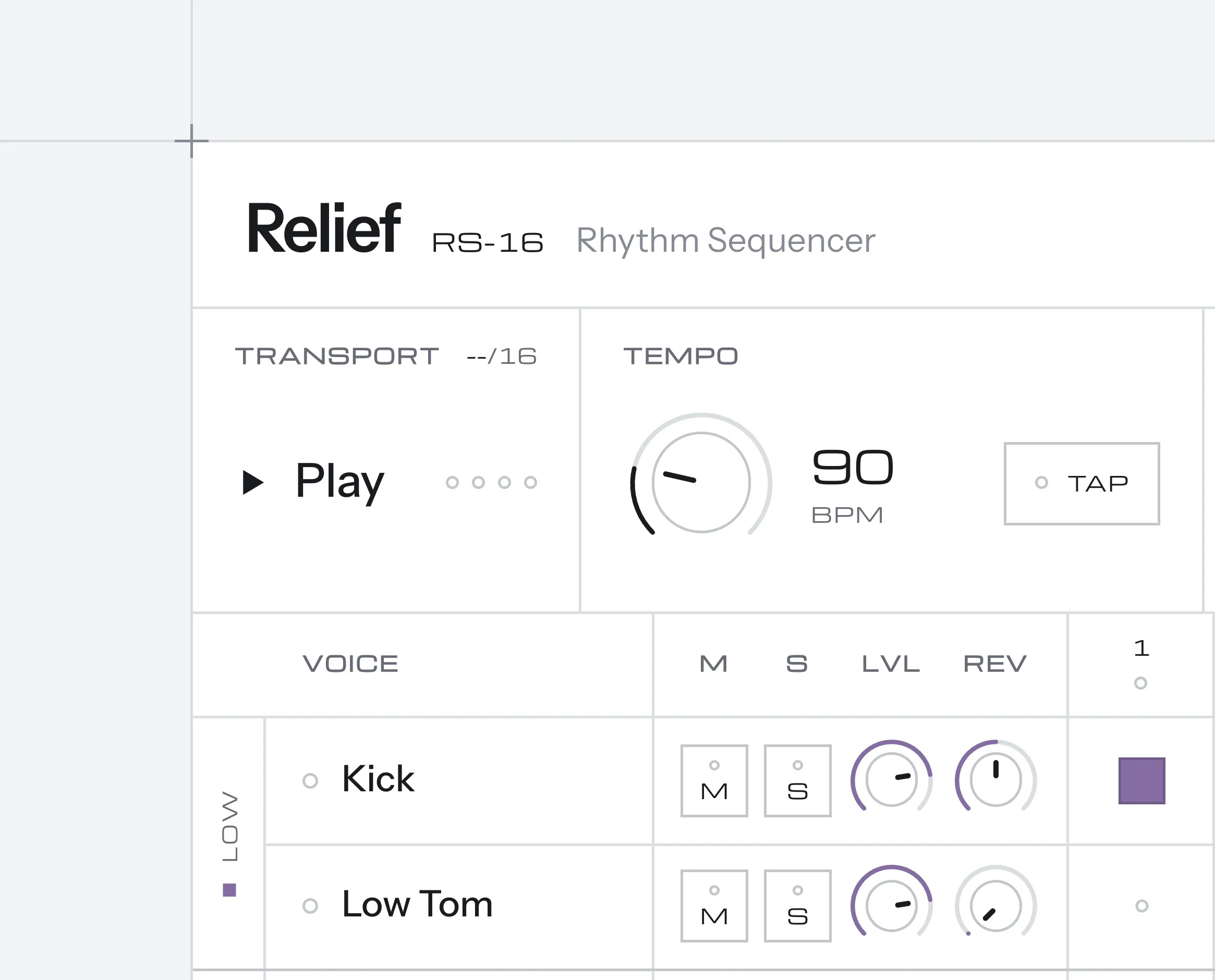
At rest the panel is white surfaces, hairline dividers and printed legends. I wanted this to look modern and digital enough while still flirting with the idea of a physical device. Something a lot of VST plugins have been doing for many years. Hover, focus or press a control and it becomes a real object, with depth, shading and a crisp edge.
Only things you can interact with do this, so the change itself is the affordance. Each control family has its own material. Knobs turn into machined aluminium with a brushed sheen and a concentric cap, while keys, tiles and pads become square plates with a soft bevel.
Hover and keyboard focus raise a control the same way, so mouse and keyboard users get the same cue.
The grid is the structure
The layout is a hairline grid, drawn like a technical drawing. Rounded corners fought that grid, so every corner is square.
Controls fill their cell instead of floating inside it to clean up the look and save space.
Colour that carries meaning
There is one muted palette, and every colour in it encodes something. Voices are grouped by register: low voices are violet, mids dusty blue, highs turquoise.
The three hues were set in OKLCH at even lightness and chroma, so they feel consistent. The spectrum analyser uses the same code, so a kick lights the left of the display in the same violet as its row. Lights are flat colour with no glow. Colors were chosen more on a personal preference of what looks neat, rather than what’s best from a usability perspective. Visualization best practices would say that the colors are too close to each other to distinguish between them properly, but that was never the goal with this experiment.
Less, but better
Most late changes were about removing overdesigned stuff. The glow around “lights”, superfluous labels around the spectrum and meter, gaps between pattern buttons. The rest were pixel corrections and typography tweaks.
Under the hood
As a prototype, Relief is a single HTML file with no frameworks, no build step and no image assets. Every surface, material and light is CSS and SVG. Animations use the Web Animations API, timed off the audio clock so a light pulse fires with its note. Sound is synthesized live with the Web Audio API, with no samples.
Reflection
The idea that carried the project is that skeuomorphism works best as feedback, not decoration. Depth appears only where it answers “can I touch this?”, so the panel stays quiet until you reach for it.
It also showed how far one system can stretch. The same three colours mark the voices, the steps and the spectrum.
Natural next steps would be a dark studio theme and a touch-first layout for tablets.